Powered By Olvy
💹 Better Root Cause Analysis
Often you see a spike/dip in your business metrics and the immediate question that pops up in your mind is - "why?". Why did that metric change the way it changed? What were the key factors that impacted that change?
Typically when you see such changes in your metrics, you'd scan through multiple dashboards or go to your data team to write queries on your data warehouse to understand the root cause of that change. This entire process can be very time-consuming. Depending on your scale, if it is large then it means that you'd need to scan through a million combinations to understand those changes.
For example, let's say you're monitoring Revenue per country, per city, and per product category (which are called dimensions). One day, you see that there is an unexpected dip in your revenue. Here are the few questions that might immediately come to your mind:
Is this dip in revenue being driven by a particular country or city or product category?
How's this change in revenue spread across these dimensions?
How did revenue change for
premiumusers vsnon-premiumusers?Let's say if 80% of your revenue comes from the USA - what were the changes in revenue for the USA?
And the list can go on and on.
This is where the Root Cause Analysis functionality of Cliff.ai comes into action. 👏

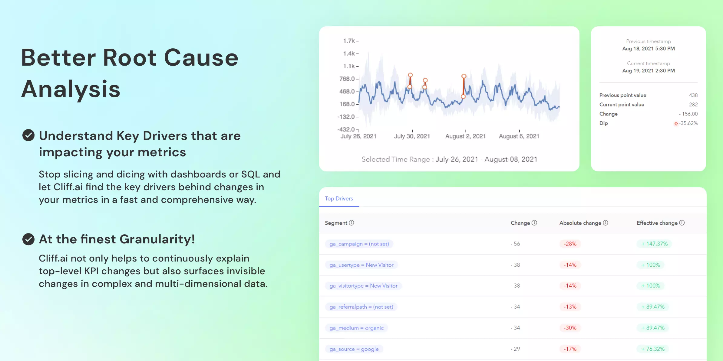
Understand why a metric changed between two time intervals
The Time Comparison feature help you understand exactly this. Select the time range for which you want to understand the change for the metric and Cliff.ai automatically scans through millions of possible explanations for these changes and helps you surface the most relevant segments that impacted this change
Understand how a particular segment behaved vs another segment
Let's say you see that revenue forUKis 30% higher than that ofUSAfor a particular time range and you want to understand what were the other factors that contributed to this difference. Is it due to a particular customer segment or demographics - you can get answers to this in a click by Group Comparison feature.
Understand metric behaviour between two points of time.
The Point Comparison feature of RCA helps you compare and analyse metric values for two points in time (first and last selected point of time). Let's say you want to compare sales between two dates in a week or month. You want to see what change has occurred in individual segments between these two points in time that resulted in a change in metric values. You can do this by the Point Comparison feature of RCA within seconds.

Understand what segments have contributed in what way to alter a metric's behaviour
Let's say you want to understand what individual factors(dimensions) have contributed to spike sales by 40% from "Aug 10 to Aug 15 " for the USA. Now you can get to know these factors by selecting the Segment Analysis feature of RCA. You can view the drill-down of these factors that have caused the spike in sales and their individual impact on sales metric for the USA.

RCA feature allows you to have an in-depth analysis of the root cause of an incident within your metrics. It provides you means to -
A better context to analyse your business and operations metrics.
A faster speed to resolution
🐞 Other Improvements and Bug Fixes
Now users can click, drag and zoom into the metric graphs.
Users are shown a list of properties for their Segment integration; this list is populated from the list of events that have already been sent to cliff from Segment.
Contributors